Alone with my screentone
It is always a bit disconcerting to find nothing on the internet about whatever it is you’re looking for. This happened to me recently in regard to screentone* – those dotty or patterny, pre-made, mostly black and grey slabs of stuff you can add to comics (and I guess other kinds of drawings but who cares about them? Not me not right now).
I’m not saying Google turned up nothing. There were tutorials on how to use screentone generally and specifically within different kinds of comics (e.g. manga** or superhero or photorealistic); screentone purchases you could make; and histories of screentone. But what I sought were examples of comic artists who use screentone in the kind of way I do - compulsive, random, self-contained and (I guess) arty. Of these there was a void (which of course doesn’t mean they don’t exist, just that I couldn’t find them).
(By way of more detailed context, screentone is a technique for applying texture, pattern, shade, that is less laborious than drawing by hand. Back in the day screentone came in flexible transparent sheets printed with a pattern and covered on one side in an adhesive wax layer. To use them you put the sheet wax-side down on some kind of paper and rubbed the sheet’s other side with some kind of stylus. When you peeled it off the ink stayed behind in the places rubbed. Nowadays you can do the same thing on a computer - bung some dots in an area using Photoshop or Microsoft Paint or whatever).
The prevalence, convenience and accuracy of digital screentone mean it’s difficult now to get hold of the analogue version. But a few years ago I was lucky enough to find a bunch of it in a dumpster. Because my approach to making comics is often - materials-wise - about using what I find rather than looking for what I need, this was a significant score. I love using screentone. So much so that when my foraged supply ran out I started making my own; photocopying downloaded dots and patterns onto overhead projector transparencies (I have heaps of these, another gift from the universe). Although this version requires gluing rather than rubbing, the effect is pretty much the same.
I found online descriptions of screentone’s purpose to be very consistent and focused on use within the competent boy comics and/or manga traditions. Statements to this effect include “…to simulate multiple sources of shadow in an image..” and “…balance panels, offset foreground from background…” and ‘…fill and define form…”. All perfectly valid, but to me boring and irrelevant.
I use screentone in the same way I use frames. In the book Reimagining Communication: Mediation, academic Neale Curtis describes my approach in an accurate and very fancy way,
“Another artist who uses embellishments and doodles to good effect is Indira Neville. Her work consistently and purposefully uses ornament to invoke a visual excess that undermines the tendency in comics criticism to privilege narrative. These are also forms of “embroidery” designed to accentuate the “craft” of comics and undercut the assumed link between truth and conventional codes of realism…Neville quite often uses this ornamentation around her panels in order to disperse with the idea that these units are simply functional. In doing so, she draws attention to the fact that the panel and likewise the speech balloon are not simply neutral carriers of content but the most iconic of comics’ graphic marks and integral to their complex modes of visual communication. Neville highlights how, as interpretable elements in their own right, they are also integral to a comic’s ethos, tone, tempo and rhythm”.
(How about that then? I am totes LEGITIMATE).
So like frames, screentone is to me a comic ornament that looks cool and makes a philosophical statement. It -
- Adds to the visual excessiveness (love that term!)
- Subverts the prevalent idea of comics as narrative, and image as a means of propelling and representing narrative.
- Reminds the reader that comics are ‘made’ and that when they’re reading this comic they’re reading this comic (as do the decorated frames, the flatness, the inconsistent and singular drawing, the brevity, my various other tricks).
- Shows my comic ethos, tradition, politics.
- Helps with the comic’s energy, rhythm, tone, timing etc.
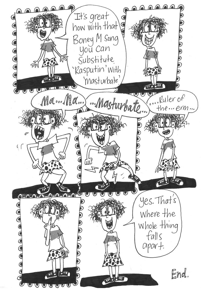
The (extremely classy) comic below illustrates these points. In it the use of screentone is limited to a stripe across the t-shirt, but the stripe is not the same as the t-shirt. Sometimes there are gaps between the edge of the screentone and the edge of the t-shirt; sometimes the screentone extends beyond the edge of the t-shirt; the screentone sits flat on top of the t-shirt, it does not for example, curve with the shape of the breasts below; the screentone’s size and shape is inconsistent across the panels. Apart from its general location under the armpits, little thought has been given to the screentone’s placement. Its shape is similarly disregarded. It looks like – and is – a series of random offcuts. The screentone has clearly just been stuck on. The comic is clearly something that someone has made.
Some readers like this. Some don’t. They find it jarring and/or perceive a lack of awareness and skill on my part (some have even helpfully offered to show me how to use screentone ‘properly’). I’m satisfied with either response.
The screentone contributes to the energy of the comic. The character is dancing and the screentone is dancing along with her. It has its own movement and contributes to the movement overall.
Like the rest of the comic the screentone is nonsensical. It has no set-up, not explanation, no real narrative purpose. It reflects and contributes to the intended ridiculousness of the comic.
It is another distinct visual element. It exists alongside the character and her accoutrements; the speech bubbles; two different types of lettering; lightning bolts shooting out from beneath her skirt; decorated frames; and the solid black whatever-it-is she’s standing on. It contributes to the intentional visual excessiveness (my new favourite term). I like the way visual excessiveness looks.
Not finding anyone else who uses screentone like I do, I am tempted to declare myself as some kind of comics pioneer. I bet it's not true but until I find my people, I am alone with my screentone.
*Analogue screentone is known by the brand names Letratone or Zip-a-tone or Chartpak and maybe some others.
**The use of screentone is especially prevalent in manga. Google to find out why.