Image-text entanglement
At the moment for various reasons, I kind of hate comics. I do not want to make them, draw them, deconstruct them, defend them, discuss them, organize them or write blogs about them. So I’m not going to. Except for this bit here that I’m going to finish as soon as possible so I don’t ingest it and spew (though if it was all over a pile of lame-arse boy graphic novels it would not be so bad).*
This brief and gross-feeling introduction is necessary to set up a post that is not about comics but is about a comics attribute, namely text-image interaction. This is my favourite thing and the most important thing about comics, and sequence and storytelling can fuck right off. I’ve previously ranted about this here.
Anyway! I want to write about things in which the text-image interaction is crucial just like it is in any proper comic. And that is the end of the comics reference and after I’ve had a shower to wash off the ickiness I’ll return and write the rest of this post.
I think there are two kinds of artefact where a word-picture combination is necessary for making meaning. That is if one of those components were missing nothing would make sense. These categories are about intention rather than form and I’m going to describe them as information and aesthetic (the distinction is for convenience only. You all know how I feel about binaries).
Information texts are things like maps, graphs, puzzles and diagrams, stuff that aims to inform, analyse and/or prompt action related to the real world. For example graphs connect to contexts outside of themselves and provide data about that context, and the data needs bars/lines/segments AND labels/keys/units/titles to make sense and be useful. And crosswords need boxes AND clues to enable people to do them.
Informative text-image interactions are very fascinating but likely familiar to everyone so not today’s topic. Instead I’m going to write about the aesthetic kind. In these, the picture-word combination is the object itself rather than a representation of some kind of external reality. It’s someone’s internal ideas/feelings/compulsions made manifest via dual-dependent media. I guess it’s art and as such can make some people feel some things. I feel things about the next two things.
The simultaneous book
The simultaneous book, La Prose du Transsibérien et de la Petite Jehanne de France, was a collaboration between artist Sonia Delaunay (who rules so hard) and writer Blaise Cendrars. They wanted to create a kind of art in which painting and text were indivisible and equal and had nothing at all to do with ‘illustration’.
Delaunay's wonderous shapes and colours express the sadness of Cendrar’s poem (it’s about a boy on the Trans-Siberien Express travelling in the company of a French prostitute. There’s lots of yearning and insecurity and disappointment and life passing by like the scenery through the windows). The idea is to see and read and feel all at the same time.
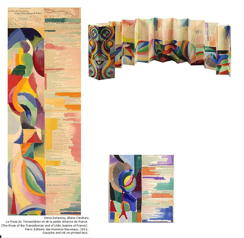
The simultaneous book was big, printed on four sheets stuck together and folded like an accordion. It had a planned print run of 150 copies that when placed end to end, were the same height as the Eiffel Tower (at the time considered a powerful symbol for modernism).
Of the project Cendrars said, “Madame Delaunay has made such a beautiful book of colors that my poem is more saturated with light than is my life. That’s what makes me happy”. It makes me happy also.
Concrete poetry
With concrete poetry meaning relies on the arrangement and appearance of words and letters as much as it does their definition, symbolism or verbal significance.
It grew out of the mid-20th century avant-garde and like the simultaneous book, aimed to move image from an auxiliary expression to a primary one. I.e. from ‘illustration’ where pictures follow on from text to a non-hierarchical integration of both forms, equally crucial for understanding. Because of this it’s seen as significant art movement and a significant literature movement. Fancy.
There have been lots of concrete poets. Here are a few of the famous ones and examples of their work:
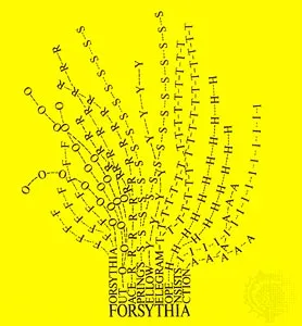
Mary Ellen Solt Forsythia 1966
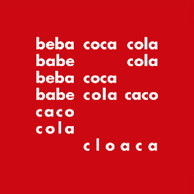
Decio Pignatari bebe coca cola 1957
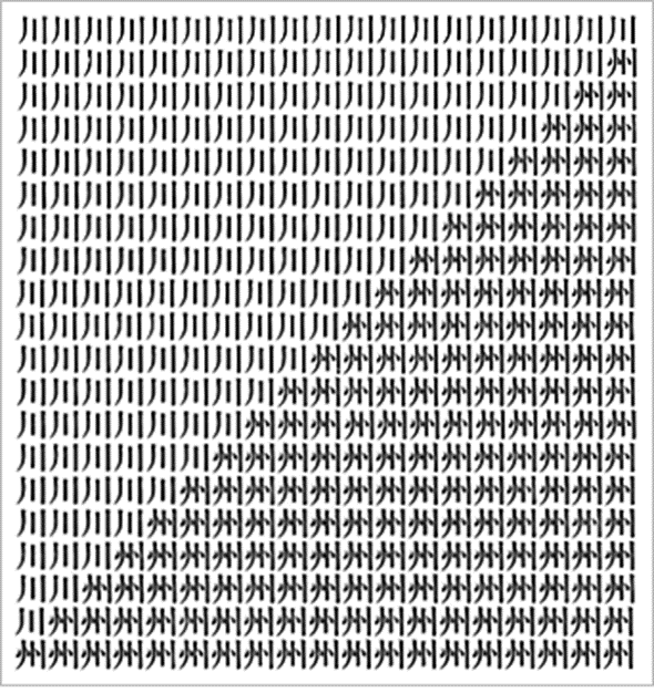
Niikuni Seiichi River or Sandbank 1966
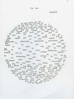
Pierre Garnier Pik Bou 1966
There’s stuff around that looks like concrete poetry. Some of it is cool - ascii art, the shape poetry kids make at school - and some of it is not - those ugly word cloud things. But I think the resemblance is superficial. Concrete poetry was consciously political, almost manifesto-driven, an attempt to subvert and confuse the written and visual divide as constructed at the time. Its content was also often political, critiquing for example capitalism and gender and culture norms. Hardcore all round.